From observations via video-- he applies tube paint (maybe some pre-mixed stuff later on) onto the canvas in very specific areas (With a pre drawing), and mixes it ON the canvas itself. texturizes it after intiail application with the palette knife.
Classifies himself as a neoimpressionist (and in a lot of ways, including the fast working method, this seems to be fairly accurate)
Most of these images come from his etsy.
I also would like to know how the hell he gets pictures with color this good.


High color. The pixilated texture is something which seem to be a halmark; done through a knid of twitch of the palette knife.


Chaotic, visually overwhelming, but in a pretty and innocuous way.


Very Doig-like

This one I'm not actually sure is by him, but it is in his styl.

Adds celebs and other pretty people sometimes. He'll also repaint the same thing or do paintings in similar style.


Creative recessive space even through high color (which traditionalists would angst to think would be used as a background area color, a recessive area color. Also areas of color-abstraction and areas of more represntational space.)


Noted for shadows.
.jpeg)


.jpg)
.jpg)


Disclaimers aside, there are things to learn. Clarity of image despite areas of high-color. Color tension. Paying attention to reflections and line. Lines in the composition. Ways to do leaves. division of canvas/division of space (linearly; how the composition leads the eye around). Obvious deployment of color theory.
paint application; laying in paint on top of areas of thick paint with pallete knife (with it loaded, cutting in but not letting it mix. Will mix on the sides. very careful about where paint goes. Probably uses the knife because if he painted this way with a brush it WOULD get muddy.) Applies paint quickly.
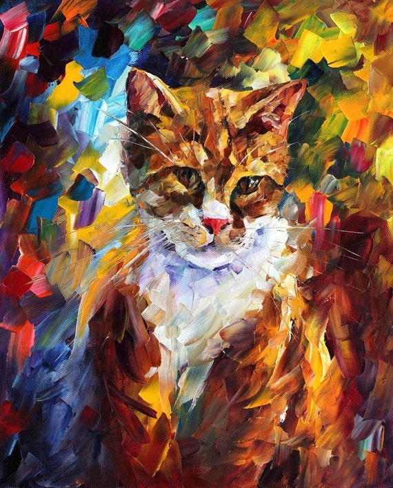
Fun bonus: kitty
Also, I'm not actually sure if he repaints the same canvas for reproductions or if he gets prints made-- his etsy would imply that he actually repaints the images people buy, each one individually, to the model of the first. Certainly, if this is not what he does in every case, he has done this before, and that's a really weird and interesting parallel to the workshop production methods of the Renn painters, who would hit on a few compositions that really worked quite well and then essentially sell the same imagery with maybe a few tweaks (like a particular patron saint in favor of another) to other clients, especially in altarpieces.
No comments:
Post a Comment