
Sunday, October 12, 2014
Wednesday, October 8, 2014
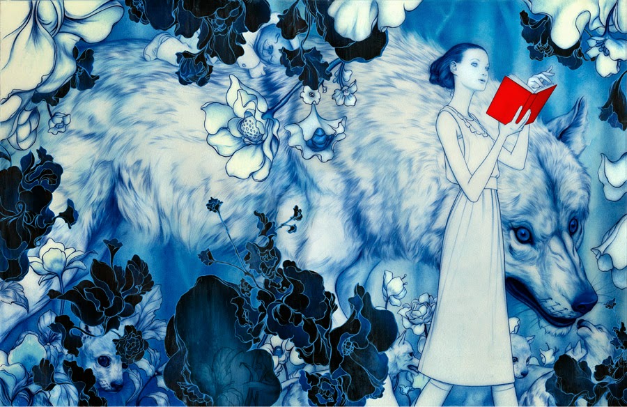
Digital work: Lament
Alas, since I cannot get things printed.
 Done in Manga Studio 5, a painting software, with some help from Photoshop.
Developed like a painting; started with a color ground, added lines of color with the blending brush tool, occasionally mixed. There was not a photograph on my working field.
This character is neither owned nor was designed by me, but I did draw this.
Developed like a painting; started with a color ground, added lines of color with the blending brush tool, occasionally mixed. There was not a photograph on my working field.
This character is neither owned nor was designed by me, but I did draw this.
Sunday, October 5, 2014
ARtist research: James Jean
Finding personal information about James Jean is difficult. His bio is a series of pictures (which I like). He is a taiwanese-american artist currently based in asia, but was raised in the states. Does both commercial and gallery work; I am most familiar with his commercial work-- specifically the covers for the Fables Comics.

Often kind of surreal. Abstract space is sometimes full of shapes. often relatively low or muted color, but still elegant. Uses color for feel; gross yellow above is disoriented. Organic-planer construction of shapes. Very soft figures and shapes in general.

Works on these images that are constructed from individual panels and put together. occasionally that's a tryptich, occasionally it is as above-- I think 86 panels in that image.

Often even pictoral backgrounds will look abstractish. Focus on shape continues. The above is "noah"


Does this outlining in color often in his paintings. Creates mass with directional lines and toning. Very tiny details.


the "horse" appears in his paintings a lot. more surreal background construructions, on the right it turns into patterns with some suggestion that it might be a landscape that they're moving through.

"coral (Schema). " A bird made out of coral echoes the drawings in one color he does; literally constructing the bird from directional lines which in this situation are coral.

Smaller subdued images occasionally. This is digital coloring and graphite. (I know how to do this i should explore this method more often)

Tryptich. The huge animals/monsters appear frequently, almost become features of the alien landscape. Backgrounds do tend to be high color.


This image is about the four seasons, though in other images the shifting between landscapes types is present; may have symbolic connotation.

Occasionally does more naturalistic portraits of people, but will still include elements of his fantastical or abstract stuff-- in this case abstract shapes which recall recorative patterns; in others it might be a single color scheme or dripping paint.

Circular composition; interesting combination between washy color and linear rendering present elsewhere.


Below are the fables covers, of which I am more familiar. These tend to use subdued color and soft less-planer built forms. Figures direct composition. Decorative patterns and/or abstraction that recalls decorative pattenrns often appear in these. Obligatorily, they covers reflect what happens inside the story. Will use washy color to set the mood, or focus the composition on primarily one or two colors; will also use intensity of color/rendering to guide the eye to the main area of the comp.


Saturday, October 4, 2014
Materials research: Qi-ya, physics.
http://arxiv.org/abs/1305.3760
Really really interesting physics article on Qi-yi, which is the tendency of chinese scrolls to curve outwards across their length.
IF i am reading this correctly (and it is possible that I am not, becuase my knowledge of physics is extremely limited), it suggests that this tendency comes from the way these scrolls are stored rather than the way they are mounted.
it suggests a few ways to mitigate this:
1) "align the main fiber direction of backing paper... along the length."
2) add extra layers to the side borders
3) poke the backside of the scroll with a stiff brush-- already a practice in japanese mounting, poke not in region 1 (not entirely sure where that is-- i think it's the actual region which curves, so the outter edges???). japanese practice pokes the entire paper.
4) use a larger roller for storage than for display.
Further research which may be useful:
How to mount paintings on paper and on cloth
japanese scroll techniques
japanese scroll mounting techniques
chinese scroll mounting techniques
how to size paper
how to size cloth
Artist Research: Short; martin Sati


Establishment of recognizable figures through pattern (which i sometimes do); colorful pattern.
Saturday, September 27, 2014
Ideas List 1: Materials research
Ideas:
- Scrolls: sized with different levels of solution (start at 50/50%), paint with watercolor, ink, and absorbant ground + those things. Roll, and see if it cracks. at least one with oil
- Water down frisket 50/50 and see if it pulls up rag paper and rag paper with paint.
- small wood bits: one with cloth, one with DS absorbant ground, one with strait watercolor. one with transparent ground?
- In the scrollforms, try to arrange them like historical stcrolls
- REACT to the cloth in the paintings (A la surrealism) instead of planning it out beforehand. make bases for these images and react to those in paintings too.
- PRINT on cloth. Do one etchig, one watercolor monoprint maybe (to see about its visibility)?? and then try to combine the two? sizing the cloth first would likely be a good idea.
- consider making collages out of cloth scraps and using those as substrates and/or reacting to those in paintings. theoretically cloth can be layered on itself with the same sort of technique as sizing, which would also size it.
Trace suggested stitching on the cloth paintings with some kind of thick string to make them more of an Object and justify their non-stretched-on-stretcherbars existence/justify them being displayed in the way they were painted.
Interested in doing this. must find a way to incorporate such stitching while keeping the focus on the paint. don't want to abandon the paint, that's the fun stuff.
possibly a border or can ALSO be used as a way to shore up the extremely fragile edges of the cloths, which were never made to be canvas and even sized have some structural difficulties.
Potential drawback in association/meaning; leah cooper asked about the cloth as a substrate for the paintings, said that any kind of cloth/stitching/etc might bring in associations of feminism/reclaiming crafts/etc. I told her it was a reference to tapestry and cloths of honor. Adding stitching onto the cloths might add additional layers to the other meaning, which while not nessicairly something i want to spurn is not what i'm going after in my paintings and are somewhat distracting to the meaning (especially the ones about being alternative gender; i already get misidentified as female).
Rebuttal: tapestries ARE made of cloth and stitching so this shores up that association; that association is not globally accurate since there are several cultures for whom the making of clothing is associated with masculine identities (and still other cultures that had non-binary concepts of gender but we won't go there outside of a seriously researched paper). and also that i can make whatever associations i want so fuck off.
Rebuttal: tapestries ARE made of cloth and stitching so this shores up that association; that association is not globally accurate since there are several cultures for whom the making of clothing is associated with masculine identities (and still other cultures that had non-binary concepts of gender but we won't go there outside of a seriously researched paper). and also that i can make whatever associations i want so fuck off.
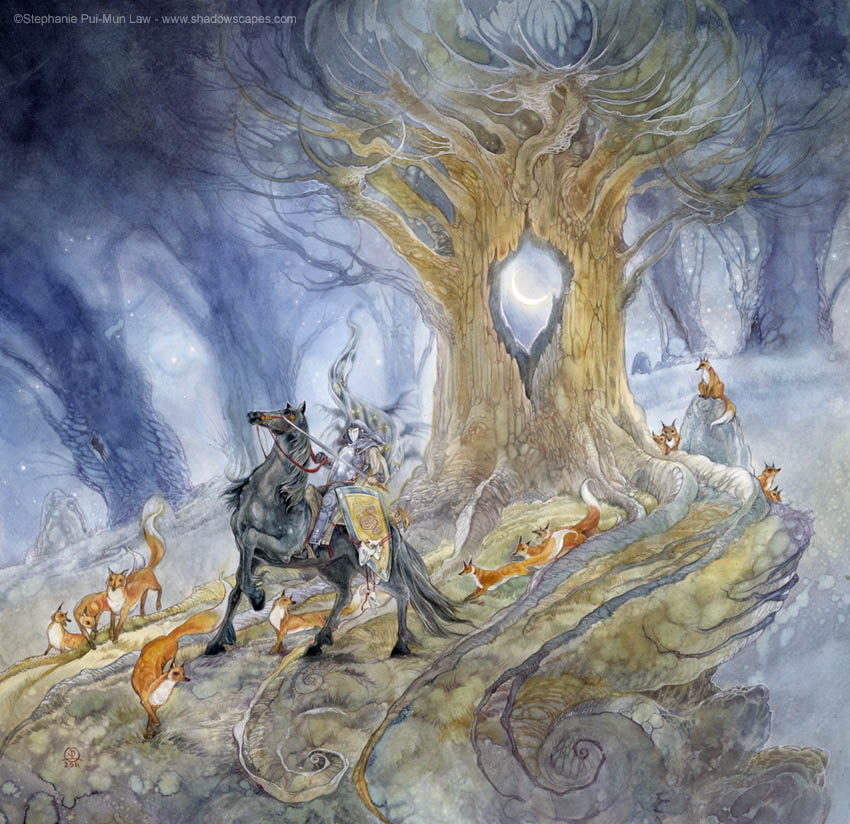
Artist Research: Stephanie Pui-Mun Law
An illustrator/painter currently working. BA from University of California. Fairly prolific. Published my major sci-fi/game situations.
I watch her facebook and she often answers questions on her page. She makes her own paints and buys pigments from Kremer (?) because the colors are better. Uses DS absorbant ground and speaks well of it; uses it as WASHES to allow subtle colors to show through. Also uses it to create raised relief areas, slightly. Fairly friendly actually. Does small paintings on odd materials, also with DS absorbant ground.
All images from her website; ©Stephanie Pui-Mun Law


MOST OF THE FOLLOWING were originally placed between the images, but i had to upload them onto the blog directly and i did that all at once, so the assessments/thoughts/results of thought digestion are all in a group below.
Beautiful lush worlds, beautiful colors. very atmospheric paintings. Excellent technical skill. An entire gallery of works from a series on mythology and fairtales, which also influence me. Works on paper.
Color! Tiny details. Layers of color. Atmospheric and deep space. Occasionally western perspective styles, but hangs that on occasion when it's convenient. Lots of interesting critters.
EXTREMELY prolific; i remember some of these thumbnails on my FB feed a few weeks ago. several pieces a year. Seems to work for a long time on these htings.
Making a tarot deck which are, by their nature, extremely heavy on symbolism and iconography. Building meaning in intricate ways is a hallmark of good tarot decks; wish to integrate that intelligence into my own work.
Perspective systems may vary depending on the needs of the work. as do building backgrounds and compositions.
Great delicacy; doesn't loose its identity or integrity or subtle beautiful color despite having so much detail and activity. Calm chaos.
I want to incorperate this level of detail into my own work, and learn how to build landscapes that are both fantastically convincing but also boost the qualities of my work.
many of these are professional illustrations, commissioned. others seem to be personal works.
Subscribe to:
Posts (Atom)