Finding personal information about James Jean is difficult. His bio is a series of pictures (which I like). He is a taiwanese-american artist currently based in asia, but was raised in the states. Does both commercial and gallery work; I am most familiar with his commercial work-- specifically the covers for the Fables Comics.
Often kind of surreal. Abstract space is sometimes full of shapes. often relatively low or muted color, but still elegant. Uses color for feel; gross yellow above is disoriented. Organic-planer construction of shapes. Very soft figures and shapes in general.
Works on these images that are constructed from individual panels and put together. occasionally that's a tryptich, occasionally it is as above-- I think 86 panels in that image.
Often even pictoral backgrounds will look abstractish. Focus on shape continues. The above is "noah"
Does this outlining in color often in his paintings. Creates mass with directional lines and toning. Very tiny details.
the "horse" appears in his paintings a lot. more surreal background construructions, on the right it turns into patterns with some suggestion that it might be a landscape that they're moving through.
"coral (Schema). " A bird made out of coral echoes the drawings in one color he does; literally constructing the bird from directional lines which in this situation are coral.
Smaller subdued images occasionally. This is digital coloring and graphite. (I know how to do this i should explore this method more often)
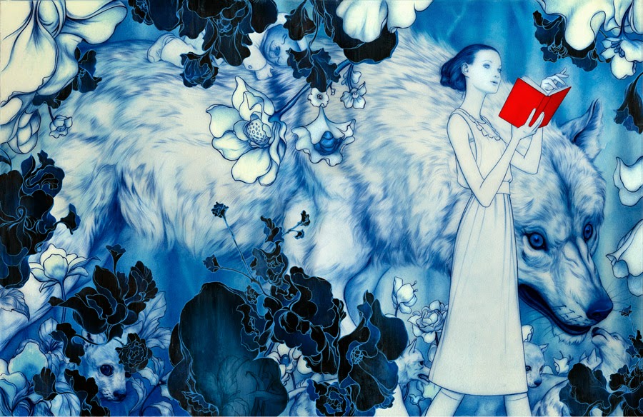
Tryptich. The huge animals/monsters appear frequently, almost become features of the alien landscape. Backgrounds do tend to be high color.
This image is about the four seasons, though in other images the shifting between landscapes types is present; may have symbolic connotation.
Occasionally does more naturalistic portraits of people, but will still include elements of his fantastical or abstract stuff-- in this case abstract shapes which recall recorative patterns; in others it might be a single color scheme or dripping paint.
Circular composition; interesting combination between washy color and linear rendering present elsewhere.
Below are the fables covers, of which I am more familiar. These tend to use subdued color and soft less-planer built forms. Figures direct composition. Decorative patterns and/or abstraction that recalls decorative pattenrns often appear in these. Obligatorily, they covers reflect what happens inside the story. Will use washy color to set the mood, or focus the composition on primarily one or two colors; will also use intensity of color/rendering to guide the eye to the main area of the comp.


No comments:
Post a Comment